Tagged: art
Mardi Garage: Herb Roe, Festival International de Louisiane and a Prime Location

Herb Roe, “Courir de Mardi Gras – Number 14″, oil on canvas, 16″ x 20″, 2010, photograph courtesy of the artist

Herb Roe, “Courir de Mardi Gras – Valse du Vacher”, oil on canvas, 24″ x 36″, 2012, photograph courtesy of the artist

Herb Roe, “Courir de Mardi Gras – McGee’s Medley”, oil on canvas, 30″ x 40″, 2013, photograph courtesy of the artist

Herb Roe, “Tee Courir – Number 27″, oil on canvas, 5″ x 7”, 2013, photograph courtesy of the artist

Herb Roe, “Tee Courir – Number 29″, oil on canvas, 7” x 5″‘, 2013, photograph courtesy of the artist

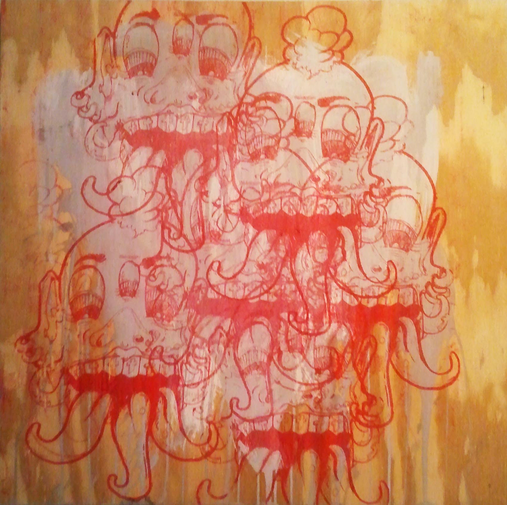
Herb Roe, “Danse a’ Cheval II”, graphite on paper, 18″ x 24″, 2012, photograph courtesy of the artist

Herb Roe, “Cajun Fiddler I”, hand-painted lino block print, 10″ x 12″, 2012, photograph courtesy of the artist

Herb Roe, “Cajun Fiddler II”, hand-painted lino block print, 10″ x 12″, 2012, photograph courtesy of the artist
by Reggie Rodrigue
It’s late April, and Mardi Gras is just a memory in our collective rearview mirror in Louisiana. However, the bon temps keep rolling! Festival International de Louisiane is about to kick off this Wednesday, April 24, 2013 in Lafayette, LA. This 5-day world music festival juggernaut,”featuring six music stages, food court areas, street musicians and animators, arts and crafts boutiques, art galleries, beverage stands, cultural workshops, international cooking demonstrations and a world music store,” (www.festivalinternational.com) will take over Downtown Lafayette for another year.
In the midst of all of the international frivolity will be Lafayette artist Herb Roe. For this year’s installment of Festival International de Louisiane, Roe has decided to open an exhibition of his “Courir de Mardi Gras” paintings, drawings and prints in the Garage, located at 205B West Vermillion St., Lafayette, LA, which is – surprise, surprise – a former garage. The location itself will be ideal for viewing Roe’s work as the Garage will be right beside the Vermilion St. Open Market once Festival begins.
To anyone from outside South Louisiana, Roe’s “Courir de Mardi Gras” works may seem like something out of a Surrealist phantasmagoria, with their grotesque depictions of otherworldly protagonists running amok in a bucolic setting. However, Roe is a died-in-the-wool realist painter, and his “Courir de Mardi Gras” works faithfully depict what the celebration of Mardi Gras in rural South Louisiana actually looks like in real life – minus the occasional post-apocalyptically red sky (You can’t keep it real all the time – as any Dave Chappelle fan knows). In Roe’s work, one comes face-to-face with the bizarre yet rich tradition of the rural Mardi Gras.
Participants in the celebration make their own costumes, replete with homemade mesh masks and conical dunce caps. They ride on horseback through the small towns of Acadiana, creating mischief, teasing young children, performing feats of daring and chasing chickens donated by locals for the communal gumbo pot to be shared at the end of the day. In rural Acadiana, Mardi Gras is a day when the natural order of things is overturned and mayhem and merriment rule before the Catholic fasting season of Lent begins.
What’s especially engaging about Roe’s work is the perspective he has on this Louisiana tradition – for Roe isn’t originally from Louisiana. He was born in Ohio, and spent his childhood and adolescence between that state and Kentucky. Roe’s work with Lafayette, LA muralist Robert Dafford lead him to the Hub City and the subject of his current work. Certainly, he has spent a great deal of time living and working in Louisiana – enough to be considered a local by our standards. Yet, in his paintings of the Courir de Mardi Gras, one begins to understand his unique perspective of being an outsider on the inside track to one of Louisiana’s most mysterious and mystifying cultural experiences. Roe’s application of paint is almost clinical and diagnostic in it’s realism, and points toward his status as an observer outside of the scenarios which he is depicting. However, the scenarios are so removed from the daily currents of normal life that Roe’s realism is swallowed up in the tidal flow of color, pattern and pageantry that he is depicting. In this way, the wall between observer and participant breaks down in much the same way that the Mardi Gras celebration breaks down societal inhibitions and hierarchies. When viewing Roe’s “Courir de Mardi Gras” works, one succumbs to the ecstatic, drunkenness of the images in all of their obsessively detailed, hyperrealistic, stranger-than-fiction glory. They are a profound visual treat for anyone, whether you’re from Mamou, LA, Moscow or Madagascar, and the perfect visual accompaniment for the joyous celebration that is Festival International de Louisiane.
Herb Roe’s “Courir de Mardi Gras” exhibition at the Garage (205B West Vermillion St., Lafayette, LA) will be open during Festival International’s officially scheduled hours. For further information on Festival times and other Festival related information, visit its website, http://festivalinternational.com/site.php.
To visit Herb Roe’s artist website, follow this link: http://www.chromesun.com/
“My Eye” on Louisiana: The Works of Kerry Griechen


All photographs by Kerry Griechen, courtesy of the artist and My Eye Photography
by Reggie Rodrigue
Having a wandering eye is typically not something of which to be proud – unless one is a photographer. In that case, having a wandering eye is essential. Curiosity about the physical world around oneself and the intense obsession with capturing an image of it either objectively or subjectively (and who can really tell the difference between the two anymore) is the basis for all of photography. Mature photographers typically focus on one or two particular corners of reality; however, every serious photographer I know started his career with an indomitable drive to document his life and travels in light, photographing everything that his insatiable eye could consume until he found a subject or a process that truly spoke to him.
Lafayette, LA‘s Kerry Griechen is a photographer of many things. However, his eloquence comes to the fore when he is focusing on the natural wonders, urban landscape, and people of South Louisiana. Griechen’s body of work offers viewers a dazzling and beautiful mosaic of life in the region from a mother roseate spoonbill feeding her fledgling in the wild or the time-worn pastiche of a decrepit warehouse facade to a New Orleanian starting his day by hosing-off a French Quarter sidewalk.
In truth, none of these subjects may be particularly new or novel to South Louisiana’s native population. They may not even be new or novel to people outside of the state. There isn’t much in the way of disquieting or provocative imagery in Griechen’s photographs. He isn’t exploring some esoteric or conceptual process in his photography, either; although, he does dabble in Photoshop techniques every once in a while to highly mixed results that veer toward the dismissible. Therefore, some avant guardists may wonder about the artistic merit of such work. One can hear their groans: “Beauty for beauty’s sake? Bah! Humbug! Bring me an MFA grad who eats glass, takes photographs of his excrement and subjects said photographs to a complex chemical process that renders them illegible! Now that’s art!” That may very well be art in the right hands, but a straight-forward, beautiful image of the world can be art as well – in the right hands. Griechen proves this over and over.
In his most arresting photographs, Griechen focuses his sharp eye for composition, pattern, texture and color on mostly solitary figures and quiet moments devoid of any human presence. Through his simple process, he manages to mine some complex and layered images of Southern Louisiana that are both mundane, serene and, simultaneously, breath-taking in their attention to detail. When other people may walk past a dirty, brick wall festooned with an electrical meter, water pipes and graffiti, Griechen sees an opportunity to zoom-in tightly on the particulars and create a quasi-abstraction that would look smart beside a Kandinsky. The combination of a fence and the corner of an Acadian house with a stairway leading to its garconniere offered another photographic opportunity to Griechen: in this instance, he deftly exploited the angles of the architecture to create an image of visual complexity to rival any of M.C. Escher‘s imaginary labyrinths. Griechen has taken a photograph of a walking path surreptitiously created between a group of sugarcane harvesting trucks that visually echoes a path through an autumnal wood. He captures lush, green water lily pads or cypress trees framing and offering a sense of depth and scale to lone and elegant egrets in the wild. He finds visual drama and dynamics in an open doorway which leads from the blunt geometry of a worn, green French Quarter wall to a luxurious and inviting courtyard or the sight of a rainbow as seen through the nets hanging from a trawling boat. He also finds something poetic in the sight of a man putting away a pack of cigarettes into his jeans pocket while lingering in the doorway of a New Orleans tourist trap. To come full circle – if one looks closely to the left portion of this image, one can spy a three-quarter profile view of the graffitied wall mentioned at the top of this paragraph.
It’s no secret that in many respects, Griechen is tackling some well-worn, cliched Louisiana subjects, but it is the depth and precision of his response that rescues them from banality and superficiality. That, in and of itself, is an art. There is something to be said for a body of work that simply and effectively renews one’s interest in the world around oneself with all of its wonder and beauty. For all of those people who cannot accept an unabashedly beautiful, if somewhat conventional, image as art, I have this to say: artistic rigor is one thing; artistic rigor mortis is another thing, entirely. Too many artists these days confuse artistic rigor with difficulty, obtuseness and the idea that beauty is anathema when beauty (whichever way it is achieved) is really the name of the game and the game itself.
Some people find beauty in nature or the streets. Some people find beauty in geometry or abstraction. Others find beauty in ideas. Some find beauty in sexually charged material or blood, guts and excrement, and others find beauty in nothing.
However, the best people find beauty in everything!
Kerry Griechen is currently exhibiting his work in Lafayette Consolidated Government’s City Hall building on the corner of University Ave. and St. Landry St. in Lafayette, LA until the first week of May 2013.
To view more works by Griechen online, visit his website www.myeyephotos.com
Cultcha! Cultcha! Cultcha!

I’m very excited to announce that recently I got invited by the Acadiana Center for the Arts to be an ongoing contributor to its blog. My first official post is up, and it’s on the vital role culture and arts play in the South Louisiana. If you’d like to read it, follow this link to the Acadiana Center for the Arts Blog site.
Pattern Recognition: Stephanie Patton and Troy Dugas at Arthur Roger Gallery
by Reggie Rodrigue

Stephanie Patton, “Intersection,” vinyl, batting and muslin, 2013, 62 x 60 x 4 inches, photograph courtesy of Arthur Roger Gallery

Troy Dugas, “Rye Whiskey Blue,” vintage labels mounted to paper, 2012, 72 x 72 inches, photograph courtesy of Arthur Roger Gallery
Patterns. They’ve always held a fascination for us. We divine them from nature. We see them emerge in our own lives. We reconstruct them. We interpret, alter and interpolate them.
In truth, being able to see, recognize and interpret patterns is crucial to the survival of the human species. Without some sort of pattern recognition, no higher-order organism could function or survive or be called a higher-order organism, for that matter. This is because pattern is intrinsically linked to organization. Pattern is in our DNA, our brain structure, along with the rest of creation.
Pattern is also that upon which we build our digital lives and affect change in the real world of the 21st century. In the digital realm, we use complex algorithms – a finite set of mathematical procedures performed in a proscribed sequence – to compute vast amounts of data that would otherwise be impossible to do without algorithms. From these computations, we can begin to interpret patterns in the data. By doing so, we can better understand a pattern that may be an invisible or underlying cause of an issue which confronts us such as climate change, traffic flow or any number of other complex problems that are bigger than one mind can bear.
Currently at the Arthur Roger Gallery in New Orleans, two Lafayette, LA artists who bring pattern to the fore in their own works are exhibiting: Stephanie Patton and Troy Dugas. Within both bodies of work, the two artists begin with a simple premise, a minimum of materials, and a highly repetitive process. However, their finalized works speak to the complexity, beauty and meaning that can unfold from such humble and rudimentary origins.
Stephanie Patton is a multimedia artists who currently lives and works in between Lafayette, LA and New Orleans, LA. She received a BFA in Painting from the University of Louisiana at Lafayette in 1993 and an MFA in Photography from the School of the Art Institute of Chicago in 1996. After this, she spent some time living in New York City, engaging in the art scene there as well as taking classes with the Upright Citizens Brigade Theatre, where she honed her skills as a comedian. In 2001, Patton returned to Lafayette, LA and continues to grow her career as an artist as well as an educator. She also became a member of the wildly successful New Orleans artists’ collective, The Front.

Stephanie Patton, “Strength,” vinyl, batting and muslin, 2013, 79 x 79 x 15 inches, photograph courtesy of Arthur Roger Gallery

Stephanie Patton, “Valor,” vinyl, batting and muslin, 2013, 81 x 81 x 15 inches, photograph courtesy of Arthur Roger Gallery

Stephanie Patton, “Meeting,” vinyl, batting and muslin, 2013, 55 x 86 x 17 inches, photograph courtesy of Arthur Roger Gallery
Patton’s exhibition at Arthur Roger Gallery is titled “Private Practice.” The title is now part of a running joke with Patton’s work. Her last exhibition at The Front was titled “General Hospital.” Both titles refer to soap operas/dramas centered around doctors and medical environments.While the thought of naming one’s art exhibition after such processed cheese from television is extremely humorous, there is another point to the titles. They offer a point of entry and a certain amount of accessibility for the viewing of Patton’s Postminimalist works. The titles – with their allusions to drama, tension, sickness, healing and recovery – give viewers a clue that Patton’s works are more than just exercises in design and pattern.
Most of the works on display in “Private Practice” are quilted and shaped wall sculptures composed of white vinyl, batting and muslin, which hover and undulate before the viewer like some sort of hybrid between a cloud, a work by Frank Stella and a mandala. The works are anodyne, yet forceful and rigorous. Patton has found a way to take soft materials associated with rest and transmute them into a series of objects that speak of strength, presence, perseverance, and healing. It is an impressive feat, and viewing these pieces puts one in the frame of mind to think about, not only the more abstract and metaphysical ideas engendered in the work but, also, the thought, time, work, skill and care that went into sewing and composing it.

Stephanie Patton, “Conquer,” Video, 8 minutes 8 seconds, 2013, photograph courtesy of Arthur Roger Gallery
The real tour-de-force of Patton’s exhibition is a video, however. “Conquer” is 8 minutes and 8 seconds of gut-wrenching pain and claustrophobia followed by sublime relief and stoic transcendence. The video begins with a close-up of Patton’s head, neck and shoulders covered in a tight latticework of band-aids which gives her the look of a badly sculpted, clay bust. She stands before her work “Intersection.” The work acts as a formal backdrop to the action in the video. The action begins with Patton searching for an appropriate band-aid to pull. She finds one, and then … RIP! The pain of the action is palpable, and it just keeps going for what seems like an eternity of band-aid ripping; however, it is riveting. One winces and squirms while Patton steadily removes her dummy mask, keeping time with the sounds of her breathing and those nearly interminable separations of adhesive bandage from flesh. By the end of the video, Patton’s full face emerges from its cocoon. One can almost feel the blood coursing through her inflamed skin. Her wide, watery eyes stare out at the viewer with a startling amount of restraint; yet, there is also much in the way of clarity, openness and beauty in her gaze as well. It’s a brief moment of silent reflection and equanimity … and a challenge to the viewer to move through whatever pain is stifling his/her life into a similar state of unshakable grace.
If you would like to view Stephanie Patton’s video “Conquer,” please follow this link to the Arthur Roger Gallery website.

Troy Dugas, “St. Jerome #4,” European liquor labels on paper, 60 x 60 inches, 2012, photograph courtesy of Arthur Roger Gallery

Troy Dugas, “Fragancia,” cigar labels on cut paper, 47 x 47 inches, 2013, photograph courtesy of Arthur Roger Gallery
Speaking of unshakable grace, artist Troy Dugas has that in spades as well. One needs such things to produce work at the same caliber as Dugas’ vintage label collages.
Dugas graduated with a BFA from the University of Louisiana at Lafayette in 1994. In 1998, he received his MFA from the Pratt Institute. He currently lives and works in Lafayette, LA.
Early in his professional life, Dugas began working with a particular form of collage that involves using duplicates of the same image, rather than the usual pastiche of dissimilar images and materials that typifies most collage. To put it in mathematical terms (which somehow seems fitting), if the usual form of collage is a process of addition, then Dugas’ form of collage is a process of multiplication – amplifying a single element into what seems like an ecstatic, geometric infinity of pattern. In earlier works, Dugas used identical, vintage prints of ships at sea and flower arrangements to create images that mimicked what one would see if one were to look at the original images through a prismatic lens or the compound eyes of an insect.
Today, the focus of Dugas’ work is on creating abstract designs, second-hand portraits and still lifes with large quantities of vintage product labels.
Dugas abstract works mimic sacred geometry, calling to mind the sort of patterns one would find in a church, mosque or temple. From afar, they take the form of mandalas and are quite meditative in their overall impact.
For the uninitiated, the shock comes when one realizes that these exquisite works are made of old labels for liquor, cigars, fish and canned vegetables, among other commodities. At first, discovering this is a wonderful surprise; however, if one thinks about the meaning behind such work long enough, one reaches a gray area where marketing and spirituality rub shoulders a little to comfortably with one another. This forces one to wonder whether these are glorified advertisements or the sincere works of an artist on his own spiritual path. Personally, I tend to think the latter is closer to the truth.
In an age where everything, including our own digital lives on social media websites, is a product to be marketed and advertised ad nauseum, it is difficult to find a space for reflection and spiritual pursuit that eludes the dictates of “the market.” While Dugas’ works are certainly part and parcel of the overall system of capitalism (they are being sold at New Orleans’ poshest gallery after all) and are composed of the refuse of this system, they still manage to take the viewer somewhere beyond the daily grind of consumption – a space of pure, Platonic freedom.
Dugas is involved in a game of extreme subversion. He begins a work with a pile of the lowest form of art and creates something wholly ineffable and transitive. In the context of our time, there is something truly transgressive about Dugas’ work in that it exudes skill (countering the prevailing rubric of “deskilling” in art today), it obviously takes much time and patience to complete it (two things of which most people have very little these days), and most importantly it turns pop culture and pop art on its head. Given enough green bean labels and time, Dugas can create a work of art on par with a Byzantine mosaic or a Buddhist mandala. He metaphorically takes Warhol’s soup can and runs with it in the other direction. By slicing and dicing commodity labels into a million little pieces and recontextualizing them, Dugas points to a way out of the consumerist paradigm by diving right into and through it.

Troy Dugas, “Fayum Clos du Calvaire,” European liquor labels on wood panel, 48 x 48 inches, 2012, photogrpah courtesy of Arthur Roger Gallery
However, Dugas has recently decided to go in other directions as far as the type of images he produces. His “Fayum” series is a case in point. The product labels have remained a constant and pattern still plays a key role in shaping the work, but Dugas deploys these to compose representational images which riff on the tradition of Coptic Fayum painting. This type of work flourished in Egypt during the Roman occupation of the country at the tale end of the Roman Empire.
Fayum paintings were typically made of encaustic or tempera on wood panel, and they represented living portraits of deceased individuals. These portraits were painted during an individual’s lifetime, displayed in his/her home, and then placed over the head of his/her mummy as a reminder of what the deceased looked like when he/she was alive. Fayum paintings were basically the Graeco-Roman innovation on the ancient Egyptian funerary mask.
While unequivocally beautiful, Dugas’ “Fayum Series” complicates an already complex and hybridized tradition. These works have a particular sort of resonance for our time, bringing to mind the collapse of a civilization (possibly our own included); the atemporality of our digital age where information, ideas, art, and design from vastly different eras coexist through various media simultaneously and are equally valued; an exploration of the colonialist impulses of much modern art such as Picasso and Matisse’s osmotic response to African art and our own colonialist polemics in the Middle East today; and a porous view of individual identity. Beside the infiltration of corporate logos in these works replicating ancient funerary paintings of people who actually were alive at one point in time, Dugas throws another conceptual monkey wrench in the proceedings by basing some of the works in the series on contemporary arrest photographs found on the internet. It’s a chilling touch that begs viewers to answer the uncomfortable question of what posterity and history have in store for them.

Troy Dugas, “Still Life Cactus,” assorted labels mounted to wood panel, 28 x 35 inches, 2013, photograph courtesy of Arthur Roger Gallery
The specter of modernism haunts Dugas’ “Still Life” Series a little more lightly than his “Fayum” Series, if no less significantly. Here, Dugas breaks with his convention of using a single type of label. He employs an unprecedented assortment of labels to approximate the varying colors, textures and techniques utilized in modernist still lifes. Dugas’ obsessive technique seems to loosen in these works, affording them a sense of playfulness and breezy, if scattered, sensuality.
Together, Patton and Dugas’ current artworks afford viewers vital insight into the ways pattern can be more than simple decoration. Before the onset of modernism and postmodernism in Western culture, there was much meaning invested in pattern. Viewed as symbols of status and origin, pattern was used as a tool to visually order and label the world around oneself. Because of this, every pattern had a fixed meaning. This view of pattern generally broke down under the influence of the modernist impulse to purge symbolism from visual culture. Postmodernism then relegated pattern to being a handmaiden to style and design. The beauty of the contemporary use of pattern is that now it has a freedom of use unafforded to it in the past and it can carry a plethora of meanings depending on its contextualization. This is because we approach pattern from a multitude of different perspectives in our own contemporary moment.
With Patton and Dugas, we have two examples of contemporary artists reinvigorating past forms and materials within new contexts. Their works hold the mirror up to our own complex lives in subtle yet profound ways, unearthing and reflecting undercurrents and patterns of reality. We are given the responsibility of recognizing the patterns and determining their significance.
Stephanie Patton’s “Private Practice” and Troy Dugas’ “The Shape of Relics” are both on view at the Arthur Roger Gallery in New Orleans until April 20, 2013.
Poetics, Paraphernalia and Paint: The Artworks of John Hathorn
by Reggie Michael Rodrigue
“All the soarings of my mind begin in my blood.”
― Rainer Maria Rilke
“One should always be drunk. That’s all that matters…But with what? With wine, with poetry, or with virtue, as you choose. But get drunk.”
― Charles Baudelaire

John Hathorn, “A Note on Red,” oil on canvas, glass, oil, pigment, metal, string, 2000, collection of Lucy Leslie, photograph courtesy of the author
Near the entrance to “John Hathorn – A Retrospective” at the Acadiana Center for the Arts, there is a small, rather unassuming painting on the title wall of the exhibition. It is a vertically oriented, rectangular canvas which has been treated with a thin, umber, oil paint wash and slathered with a thick impasto of red oil paint which virtually obliterates the support surface. The red paint was probably built up with the help of a palette knife over the course of several days or weeks or months … maybe even years? The skin of the painting is as luscious and dense as cake frosting, but looking at it feels more like looking a slab of bloody meat. An old specimen vile containing powdered, red pigment hangs from the bottom of the canvas, calling extra attention to the not-so-secret ingredient that makes this painting hit one square between the eyes. One’s pulse quickens. One’s mouth moistens. Desire takes hold, and the color red is in the driver’s seat.
Hathorn’s “A Note on Red” is a sensual powerhouse; yet there is something extremely lucid and cerebral about it as well with that preserved vile of pigment hanging there from that red dwarf of a canvas, proclaiming that emotion is as easy to produce in the human species as parading colored dust before our eyes. There is poetry in that idea, despite (or, possibly, because of) the Pavlovian inanity of it.

John Hathorn, “Suspension in Red,” oil, tar on canvas, wood, cloth, rope and metal. 1985, collection of H. Gordon Brooks II, photograph courtesy of the author
In the heart of Hathorn’s exhibition, another painting, “Suspension in Red,” continues the artist’s exploration of the expressive power of the color. Here, the color red sets the scene for an abstract treatise on tension.

John Hathorn, “The Grammar of Verbenas (For Darrel Bourque),” oil and conte’ crayon on canvas, 2012, photograph courtesy of the author
Further along in the exhibition, on the back wall of the ACA’s Main Gallery, one can view Hathorn’s “The Grammar of Verbenas (For Darrel Bourque),” a monolithic painting composed of a cataract of paint strokes, smudges and drips in midnight blue, black, burnt sienna and cadmium yellow on a white canvas. A scrawled line from a poem by Louisiana’s 2009-2010 Poet Laureate, Darrell Bourque, hems the right edge of the composition like the inscriptions one can find on the edges of Japanese and Chinese prints. The inscription reads “one burnt water flowing into another burnt water.”
Here, the abstract image is primary, yet the inscription – the addition of language – adds focus and direction to the image. Language makes the image more concrete and discernible, pinning it down while it seems to still wriggle with a mysterious life force of its own. Yet, the inscription leaves one to question what exactly “burnt water” is. The answer lies in the meaning behind Bourque’s poem, which concerns the consummation and obliteration of the dichotomous elements of creation to create new substances or new life – hence the paradox of “burnt water.” It is a metaphor for the way that oppositional forces and drives engender creation.
This fusion of opposites – the sensual and the cerebral – is the basis for all art. However, John Hathorn makes this fusion something overt. He makes the connection between the mind and the body the subject of his art by juxtaposing the sheer beauty of paint doing what it does on canvas with objects from the “real world” and fragments of literature, creating a trinity of human thought, gesture and artifact that stands in for the sum total of human aspiration and creation. In the end, he falls short of this goal, but anyone foolhardy enough to attempt such a thing would. What he does is manage to bring us closer to the goal which is valid in and of itself if one ascribes to the idea that “Life is a journey, not a destination.”

John Hathorn, “Raft,” wood, rope, stone, salt, metal, oil, cloth, paper, ink, floor to ceiling suspended installation, 2012, photograph courtesy of the author

Detail from John Hathorn’s “Raft,” photograph courtesy of the author

Detail from John Hathorn’s “Raft,” photograph courtesy of the author

Detail from John Hathorn’s “Raft,” photograph courtesy of the author

Detail from John Hathorn’s “Raft,” photograph courtesy of the author

Detail from John Hathorn’s “Raft,” photograph courtesy of the author
Speaking of journeys, it is somewhat easy to fantasize about taking one on Hathorn’s sublime “Raft.” The sculpture is a wooden platform covered with rugs, paintings, drawings, personal notes and other objects which hovers inches above the floor of the gallery and is suspended from the ceiling via a sturdy rope. The other end of the rope is wrapped and tied around a wooden palette topped by stone slabs and salt blocks on the other side of the gallery. The piece dominates the entrance to the exhibition.
Hathorn’s “Raft” looks like a cross between a raft, a magic carpet, a cabinet of curiosities, a studio, a DaVinci-esque science project and a construction site – all things which speak to exoticism, travel, transformation from one state to another, and/or a belief in or a hope for a better future. It is a highly personal, artistic gesture in that Hathorn used lumber left over from the construction of the studio he shares with his wife, artist Mary Ellen Leger, to make the piece. Add to that the personal ephemera and paraphernalia from Hathorn’s own practice in the completed studio, and one has access to a slice of the artist’s life, work and process combined.
Yet, Hathorn’s aspirations for the piece go beyond the personal and move toward the universal and the Romantic. One of the inspirations for the piece is Theodore Gericault’s masterpiece “The Raft of the Medusa,” a 19th century painting depicting the aftermath of the shipwreck of a French frigate off the coast of Senegal in 1816. Another inspiration for “Raft” is William Shakespeare’s play “The Tempest,” which unfolds around the central character of Prospero, a deposed duke and a magus who is trapped on a deserted island. In the play, Prospero plots to regain his title by unleashing a storm on his enemies while they are at sea which causes their ship to wreck, forcing them onto the shores of Prospero’s island where he reigns supreme. Between these allusions and the physical manifestation of “Raft” itself, one is set adrift to peruse the individual materials that together compose the work and ponder what it means to seek and find refuge in uncertain times. In Hathorn’s case, text, image and personal effects fuse to create a secure and fertile ground upon which his life and creative spirit thrive.

Installation view of John Hathorn’s work table display in “John Hathorn – A Retropsective,” photograph courtesy of the author

A painting on John Hathorn’s work table display in “John Hathorn – A Retrospective,” photograph courtesy of the author

An assemblage on John Hathorn’s work table display in “John Hathorn – A Retrospective,” photograph courtesy of the author

An assembalge on John Hathorn’s work table display in “John Hathorn – A Retrospective,” photograph courtesy of the author

An assemblage on John Hathorn’s work table display in “John Hathorn – A Retrospective,” photograph courtesy of the author

An assemblage suspended over John Hathorn’s work table display in “John Hathorn – A Retrospective,” photograph courtesy of the author

Two assemblages suspended over John Hathorn’s work table display in “John Hathorn – A Retrospective,” photograph courtesy of the author

A waste basket filled with used paint tubes near John Hathorn’s work table display in “John Hathorn – A Retrospective,” photograph courtesy of the author
A more diffuse but still compelling assembly within the exhibition is Hathorn’s work table topped with diminutive paintings and rough-hewn, little objets d’art, some of which were made as tokens of affection for his wife. The alchemical role of the artist is on display here, exposing the small but fruitful experiments and transformations of paint, objects and texts which underpin the larger works in the exhibition. With the table display, one can gain a better perspective on the artist’s process, and it is one of my favorite parts of the exhibition. I especially love the waste basket filled with used paint tubes near the table. Rather than being a side note on waste and consumption, it’s proximity to the table gives it the air of something poetic, beautiful and grand. It is transfigured into an accidental monument to love and passion for one’s craft.

John Hathorn, “Large Palette,” oil on wood mounted on steel rod in wood base, 1994-1996, one of two individual palette sculptures on display in “John Hathorn – Retrospective,” photograph courtesy of the author

John Hathorn, “Cardinal,” oil on canvas, steel plumb, string, wood, oil on wooden ironing board, 1996, photograph courtesy of the author
Elsewhere in the exhibition, one comes into contact with more paintings-cum-sculptures that explore the various themes inherent in Hathorn’s ouevre: the physical qualities of thickly impastoed paint, emphasis on the expressive and symbolic qualities of color, the elevation and suspension of objects, and an interrogation of the nature of painting and sculpture.

John Hathorn, “Large Bather,” oil on canvas, wood, glass, oil, pigment, 1997, collection of Darrell and Karen Bourque, photograph courtesy of the author

John Hathorn, ‘The Grammar of Water (Seventh State),” oil on canvas, 2006, photograph courtesy of the author

John Hathorn, “The Grammar of Water (Twelfth State),” oil on canvas, 2006, photograph courtesy of the author
There is also the running theme of water through the exhibition. Beside the aforementioned “The Grammar of Verbenas (For Darrell Bourque)” and “Raft,” with their allusions to water, there is the presence of “Large Bather” and “The Grammar of Water (Seventh State)” and “The Grammar of Water (Twelfth State).” In “Large Bather,” Hathorn aspires to capture some of the abstract play between water and light in some of the Dutch master Rembrandt van Rijn’s paintings, such as “Woman Bathing” of 1654. In Hathorn’s painting, we are given the tenebrous atmosphere of Rembrandt’s background, thick, painterly gestures standing in for the rich cloth depicted behind the Rembrandt’s bathing beauty and a bottle of amber liquid on a shelf to exemplify the interplay between light and water. With the “Grammar of Water” paintings, Hathorn simply focuses on color and gesture to achieve a painterly language to convey water’s various guises.

John Hathorn, “The Baudelaire Sketches (The Silence of the Void)” oil and charcoal on canvas, cord, metal, water faucet, 2009-2010, photograph courtesy of the author

John Hathorn, “The Desire to Paint (On Baudelaire,” oil on canvas, oil on wood, typewriter, glass, oil and string, 1998, photograph courtesy of the author

John Hathorn, “The Benefits of the Moon (On Baudelaire)”, oil on canvas, music stand, oil on panel, stone, oil can, wood, glass, pigment, ivory, 1998-2002, photograph courtesy of the author

John Hathorn, “The Baudelaire Sketches (Of a Miraculous Plant)” oil and charcoal on canvas, 2009-2012, photograph courtesy of the author

John Hathorn, “The First Word of a Poem (On Rilke),” oil and conte’ on canvas, 2012, photograph courtesy of the author
The allusions to water continue in Hathorn’s “Baudelaire Sketches” with the deployment of a suspended faucet in the painting “The Baudelaire Sketches (The Silence of the Void).” Here Hathorn rifts on the work of famed French poet Charles Baudelaire, inscribing lyrics from a poem by the author directly onto the canvas in a black scrawl and using the words as a generative element to create an image of absence. The faucet serves to trigger the memories that we all have of faulty faucets leaking water loudly in otherwise silent rooms and the loneliness and isolation of the sound.
Baudelaire looms large in Hathorn’s work because, according the artist himself, Baudelaire “used words as a physical reality … Like Baudelaire’s abstraction of language, I use paint’s physicality as the language of my art making” (from an artist’s statement in “John Hathorn – A Retrospective”). In a very real sense, Hathorn and the French poet are spiritual and artistic kin, sucking the marrow out of the physical engagements of life and the sensations they engender and transmuting these things into an art of felt experience, symbolic inquiry, and metaphysical significance. Hathorn views his work as a form of correspondence across the centuries between himself and Baudelaire. This, among other correspondences, creates a temporal shift in much of the work that seems retardaire, nostalgic or simply elegiac. The irony here is that Baudelaire was considered an avatar of modern literature in his own time and a prototype for the avante garde of the 20th century.
Another literary figure Hathorn communes with is the German poet Rainer Maria Rilke. The poet’s work generally juxtaposes stark yet lyrical physical imagery with a transcendent spirituality poised on the cusp of a pantheistic mysticism and existential angst. Though his work comes from the turn of the 19th into the 2oth century, Rilke seems to be a poet for our times as well in that the forces set into play in his own works are forces that we recognize in our own lives. His naked and direct, yet elegant, lines appeal to our sensibility for simple, unadorned language while between the lines, one gets the sense that he is reaching out for something far more obscure, yet profoundly nourishing. One can get the same sense of simplicity and profundity from Hathorn’s work.
There are other antecedents for Hathorn’s work as well, and they come from the visual arts. However, they aren’t mentioned in the exhibition: they are the Abstract Expressionsists, namely Philip Guston and Willem de Kooning, and the group of artists that immediately superseded them, such as Robert Rauschenberg and Cy Twombly. In their combined works lie the seeds for everything that John Hathorn undertakes and subtly yet personally transforms in his own work. He is in their debt for certain. This is no slight, however. It is the position of all artists to be in debt to someone or something. If we are worth anything, we choose to stand on the shoulders of giants.
With all of its correspondences with authors and artists from the past, Hathorn’s work may seem like a throwback to another era with it’s denial of the trademark tropes of contemporary art: the fixation on advertising, graphic design, and celebrity, the slick appeal of minimalism, the shock of graphic and taboo imagery, the chic deshabille of a pile of trash thrown together, the divisiveness of identity art, and the transitory and shape-shifting nature of digitalia and the New Aesthetic, along with the theatrics of performance art and relational aesthetics.
All of these things seem a long way from Hathorn’s ouevre, and rightly so. For Hathorn has conceived of a world for himself that operates at a slower pace, is more contemplative, quieter, subtler and richer than the outside world, if not as complex. The conundrum is that a complex world with ever-increasing demands on time and resources often breeds glib and facile art or conversely art that is so chaotic as to leave one feeling lost in it.
Therefore, it is an invaluable treat to be in the presence of an art which allows for a slow read and a chance to look back into the vast sea of art and literature from the past – not to dredge for kitsch, mind you, but to rediscover what is valuable, timeless and essential and return it to the light of day. Hathorn reminds us that we are most human when we contemplate the connection between mind, body and spirit. This connection has sustained humanity on it’s long journey through the centuries.
As long as we continue to forge and refine this connection, we will find comfort and refuge in our creations – the glorious life-rafts of our own making.

Installation view of “John Hathorn – A Retrospective” at the Acadiana Center for the Arts, photograph courtesy of the author

Installation view of “John Hathorn – A Retrospective” at the Acadiana Center for the Arts, photograph courtesy of the author
“John Hathorn – A Retrospective” is on view at the Acadiana Center for the Arts until April 13, 2013.
Ave Aunt Jemima, in Excelis Deo!
by Reggie Rodrigue
Kneel down and tremble before your new god, world! Like a phoenix reborn from the ashes of a bombed-out antebellum kitchen, she has arisen! Her name is … AUNT JEMIMA, and she’s servin’ up a plate full of revenge pancakes for you sorry bitches to choke on … along with some sweetness and motherly love!

Detail of the central mural of the exhibition “Uncle Tom’s Watermelon Rebellion of ’89” by Johnathan “JJ” Wilson and Pat Phillips
At least, that’s the tone of most of Johnathan “JJ” Wilson and Pat Phillips’ exhibition “Uncle Tom’s Watermelon Rebellion of ’89” in the James Mallia Gallery of the Acadiana Center for the Arts in Lafayette, LA. The title of the exhibition is a mash-up of the anti-slavery novel by Harriet Beecher Stowe, “Uncle Tom’s Cabin“, the stereotypical connection between African-American’s and watermelon, and the birth years of Wilson and Phillips.
In the center of the gallery lies a devastating mural by Wilson and Phillips of that icon of African American subservience, Aunt Jemima or Mammy. She has been remade in the likeness of the Hindu goddess of time, change, destruction, empowerment and cosmic benevolence, Kali. Her robust and corpulent frame towers over a waffle cone and a bed of ice cream, complete with candy sprinkles and a cherry on top! Like many Hindu gods, Wilson and Phillips’s Aunt Jemima is endowed with a multitude of heads and a host of arms which wield various talismans and weapons including a sword, a rooster talon, a lollipop, a plate of ashen pancakes, railroads spikes and two effigies. One is a blue corpse; the other effigy is of John Henry, the steel-driving man of American folklore.
The mural is a joint salvo by the two artists, whose aims were to redraft the exhausted and offensive stereotypes of African American folklore into images of subversive power and authority. In this sense , the duos’ mural of Aunt Jemima turns a symbol of African American/female servitude into a seething totem of cosmic motherhood as well as cosmic wrath. She represents all that is beyond and within time and creation – a notable step up from the menial pigeonhole that is the role of the mammy. Another notable facet of the Aunt Jemima mural is how form follows function here. As the mural is meant to flesh out the multiple hidden aspects locked inside the character of Aunt Jemima, Wilson and Phillips follow suit pictorially – blending their two distinct graphic styles into the depiction. Throughout the mural Phillips’ thick swaths of spray paint, squat modeling and his “staying within the lines” color-blocking give way to Wilson’s more nuanced and obsessive, calligraphic line and his play with accidental paint drips. This mural is a tour-de-force in both aesthetic and political terms.
From the mural, Wilson and Phillips diverge on their own paths, creating two distinct wings for their own personal works on either side of the gallery. Wilson’s work concerns the character of Lil’ Sambo and Phillips work centers around the folk hero, John Henry. Both icons act as masculine consorts to the central figure of Aunt Jemima.
All of Wilson’s works are painted on cheap plywood squares. Upon these abject grounds, Wilson deploys a palimpsest of painterly abstraction and a succession of prints all based from a single drawing of Lil’ Sambo which he produced at Freetown Studios.

Johnathan “JJ” Wilson, “The Six Betrayals of Sambo: Betrayal of the King,” acrylic paint on wood, 2012

Johnathan “JJ” Wilson, “The Six Betrayals of Sambo: The Betrayal of the Ogre,” acrylic paint on wood, 2012

Johnathan “JJ” Wilson, “The Six Betrayals of Sambo: The Betrayal of the Tyrant,” acrylic paint on wood, 2012
Johnathan “JJ” Wilson, “The Six Betrayals of Sambo: The Betrayal of the Heart,” acrylic paint on wood, 2012

Johnathan “JJ” Wilson, “The Six Betrayals of Sambo: The Betrayal of the Protector,” acrylic paint on wood, 2012

Johnathan “JJ” Wilson, “The Six Betrayals of Sambo: The Betrayal of the Martyr,” acrylic paint on wood, 2012
Yet, this image of Lil’ Sambo, it ain’t yo’ Pappy’s! In the classic tales, Lil’ Sambo is blacker than tar, has bug eyes, huge white lips and is constantly getting in trouble when his dimwitted schemes backfire. Wilson, on the other hand, depicts him as a decapitated head with three eyes, three tongues protruding from a gaping maw adorned with a grill made of crucifixes, three earrings on each ear and a tuft of hair that doubles as an atomic mushroom cloud.
He is the embodiment of the Holy Trinity of Christianity, the more base yet cosmic/chthonic forces of pagan mythology such as the Greek Titans, or even such literary characters as H.P. Lovecraft’s Cthulhu or Frank L. Baum’s Wizard of Oz. He is simultaneously the way toward salvation and oblivion, and in this sense can be compared to the trickster gods and deities of various world mythologies, ie: the Norse God Loki, the Native American spirit animals Coyote and Raven, or more germanely, the Yoruban Orisha of enlightenment through chaos, Eshu or Papa Legba (who is also associated with the number three).
By depicting Lil’ Sambo, in this light, Wilson manages to wrest him from the curse of being perceived as an incompetent buffoon to the stature of a divine being who uses deception and betrayal to shock the human race into a finer-tuned perception of reality as a process that necessarily involves moving through pain toward successive plateaus of ever-widening enlightenment.
The signifying and subversion continue on Pat Phillips’ wing of the exhibition with his works devoted to bringing the tall tale of John Henry, the steel-driving man, up to date. For anyone unfamiliar with the story, John Henry was said to be a freed slave who worked as a steel-driver for an American railroad company during the Reconstruction Era. Steel driving involved hammering holes into solid rock by hand. The holes would then be used to house dynamite, which, when detonated, would clear paths for railroad tracks through the American landscape of the West. It was through the back-breaking work of men like John Henry that the expansion of America across the continent really began in earnest. Railroads were vital to this expansion, and manual labor provided by men like Henry, along with prisoners in chain gangs, was crucial to the success of America’s Doctrine of Manifest Destiny. Without the speed of locomotive travel and its ability to deliver supplies, the assimilation and domestication of the Wild West would have been a much more difficult and time consuming proposition.
At the time, America was knee-deep in the throes of the Industrial Revolution, and the machine was in ascendance. A steam-powered hammer had been invented, and it threatened to displace the steel-drivers. According to the legend, John Henry challenged his boss to a race between man and machine to save his job and the jobs of his fellow African American steel-drivers. By the end of the story, Henry is said to have bested the machine, but not without giving his life for the cause. Upon beating the jackhammer, Henry collapses on the ground and dies from exhaustion.
In the decades since the tall tale came about, John Henry has surfaced in pop culture in a variety of songs, plays, books and advertisements. Most notably, he has been used as a symbol of human dignity in the face of global mechanization and exploitative labor practices in the workplace by labor movements and as a symbol of racial pride, unity and tolerance by civil rights activists. Within Phillips’s work, all of these associations come into play, but he also looks to John Henry as a patron saint for graffiti artists and taggers who work on trains and/or in train yards. In Phillips’ view, they both are underdogs who find their own ways to challenge the dominant systems which conspire to oppress and devalue them as creative individuals.

Pat Phillips, “Henry vs. the Machine,” mixed media on wood panel, 2012
Phillips is a long time graffiti artist and tagger himself, and as such, his style of painting and his subject matter draw from this experience. Aerosol paint, flash pen work and distressed surfaces are used by Phillips to connect his work to the graffitti and tagging he did in the past as well as the graffiti and tagging taking place in the street today. Though his style is rather simplistic, it serves a definite purpose as a delivery system for the complex compositions and difficult subject matter he conjures.
With “Henry vs. the Machine,” we are witness to the aftermath of the battle royale between John Henry and the steam-powered jack hammer. Yet, Henry is in the guise of a boxer. The only hint that this is a painting of John Henry comes from his name painted on the bottom of the canvas and the occasional railroad spike flying through space after our protagonist throws the KO punch that explodes the machine into it’s constituent parts (along with some teeth?). It’s telling that in the center of this explosion hovers a US marshal’s badge, equating the defunct machine with American authority/oppression. It becomes apparent that all is smoke and mirrors in this work. Henry is a stand-in for every African American who has challenged the system, including the boxers Joe Louis and Muhammad Ali and all those African American graffiti artists and taggers who have used the street and the lowly materials at their disposal to express themselves when self-expression was something one had to fight for. In many ways, it still is.

Pat Phillips, “Be Big and Strong Like John Henry (Eat Pickled Pigs Feet),” mixed media on wood panel, 2013
A similar sort of subterfuge and appropriation is used by Phillips in his painting “Be Big and Strong Like John Henry (Eat Pickled Pigs Feet).” In the painting, a depiction of Henry’s glistening, muscled arm and hand busts a can of pickled pigs feet (a soul food staple) open as a gaggle of hands grope for the feet before a background mimicking the American Flag, except the stars have been replaced by railroad spikes. Here, Phillips conflates John Henry with the cartoon character of Popeye with his steroidal can of spinach. It’s a sly appropriation of cultural power wrapped-up in a visually engaging and humorous depiction.

Pat Phillips, “Hello My Name Is (John Henry),” mixed media on wood panel, 2013
Another conceptually brilliant suite of paintings by Phillips are his diminutive “name tag” paintings – a series that concisely tells the audience what the story of John Henry is about by way of tagging Henry’s name on a depiction of a name tag.

Pat Phillips, “Chain Gang,” mixed media on wood panel, 2012
However, the humor and whimsy inherent in Phillips’ other pieces is nowhere to be found in his wall sculpture “Chain Gang,” which consists of two planks of wood painted in prison stripes, tagged with prison ID’s and chained together. It’s silent, post-minimalist power induces a pause and a shudder not unlike the sort of reaction one has standing before a grave – a shocker in an otherwise visually raucus exhibition. It offers a moment of quiet reflection about how far we’ve come, and how much farther we have to go as a society to truly be free. Afterall, slavery as a legal institution isn’t that far off in our collective rearview mirror. Its ramifications are still being felt in our culture, and chain gangs are still around. They didn’t go anywhere. Today, in many ways, slavery and forced-labor have just been either hidden from view or euphemistically tarted-up for the approval of the general public in America. Human trafficking victims (mostly females used for the purposes of prostitution), illegal aliens and guest workers toiling for pitiable wages, the teeming numbers of lower class citizens in this country who are stuck in dead-end, part time jobs that pay a sickening minimum wage or even less than that without the benefit of stable healthcare, all of the people around who are in debt up to their eyeballs due to “living beyond their means” when the deck was always stacked against them, the large numbers of African American males that get shuttled into the prison system and are forced to perform “free community service” due to their bad choices made in communities where there usually weren’t many other choices to begin with, and (lets not forget) the 3rd world sweatshop workers who make all the things we buy – all of these people are 21st century slaves in one form or another.
All that I’ve got to say at this point is: Oh Most Holy and Divine Aunt Jemima, roll-up your sleeves! We’ve still got work to do!
As another civil rights activist, Harry Belafonte, once sang, “Day O! Day-Ay-O-Oh! Daylight come an me wanna go home!”
Let’s get off this banana boat, y’all!
Other LINKS:
* Harry Belafonte singing “The Banana Boat Song”
* Public Enemy singing “Fight the Power”
* Lightning-Long John (Old song by a chain gang)
* Lead Belly singing “John Henry”
* Betye Saar: The Liberation of Aunt Jemima
Signs, Signs! Everywhere There’s Signs!
by Reggie Michael Rodrigue

A cover of “The Great Gatsby” by F. Scott Fitzgerald
In the novel “The Great Gatsby,” the penultimate meditation on the dark heart of America in the Roaring 20’s, the author F. Scott Fitzgerald introduces his readers to a profoundly denatured landscape – a modern wasteland – known as the Valley of Ashes. It is a toxic zone where industrial ash is dumped between the embarrassingly affluent, new money enclave of West Egg, Long Island and the bright lights and big dreams of New York City. In the context of the novel, the Valley of Ashes symbolizes the spiritual, social and environmental decay that is the end result of a life spent in the unbridled pursuit of wealth, consumption and pleasure at any cost.

An ashpile
Within Fitzgerald’s wasteland, particular interest is paid to signage and advertisements. As the American economic engine of the 1920’s raced into its seemingly dazzling future with the fury of a hellbent Duesenberg after WWI, advertising was there to stoke it’s fire. Consumerist culture reached a new apex in the 1920’s due in large part to the nascent proliferation of newspapers, magazines, leaflets, billboards, electric/neon signage and radio. All of these media converged on the nation and advertised the latest and greatest innovations to a public desperate to move past the horrors of the war into a modern, gleaming pleasure dome of unknown convenience and luxury.
The cultural landscape of the nation succumbed to desire, and Fitzgerald was keenly aware of this. The most potent and terrifying symbol in “The Great Gatsby” is not the Valley of Ashes itself, but a faded billboard located in this liminal zone. The billboard advertises the practice of occulist, Dr. T.J. Eckleburg. The billboard simply presents the large, bespectacled eyes of the doctor hovering over all of the desolation. On one hand, the billboard represents the eyes of God judging America from on high. On the other hand, the billboard obliquely represents an erosion of progressive vision and meaning in a land engulfed in wantonness and consumption. Fitzgerald seemed to be saying that when all of the images a people hold sacred are foisted back on them for the purposes of selling toothpaste, gasoline and soda, the world becomes meaningless and a vacant shell only suitable to be filled with more commodities and the refuse left behind after the act of consumption has taken place.

Recreation of the Valley of Ashes with Dr. T. J. Eckleburg’s Billboard as described in F. Scott Fitzgerald’s “The Great Gatsby”
Nearly a century after Fitzgerald’s time, the transformation of America by capitalists and the media into the world’s used car lot is complete. Nearly every square inch of America has become mediated for the purposes of selling something, whether it’s cars, smart phones, breakfast cereal, insurance and healthcare, public schools, ideas and even you, dear reader. You’re being sold, too. Take some time to look up what a “data broker” is and delight in the fact that personal information about your life and what you buy is a commodity as well – to be schilled to corporations thanks to the ease of aggregating terabytes of data by way of the ubiquity of digital technology in our lives. The implications of this brave, new world of consumer data mining are vast. Whereas the media of the 20th century was all about creating large, singular marketing projects that were meant to carpet bomb the cultural landscape of the time for mass effectiveness, the media of the 21st has learned to be a lot more insidious and personal. After all, what company really needs billboards anymore, when said company can interact and send perfectly targeted advertisements to prospective consumers through Facebook and other social media sites selling your personal information, where the masses commune alone-together inside the pseudo-privacy of their digital bubbles.
In this sense, pop culture has begun to eat us and itself. We’ve begun to be nostalgic for a simpler time when pop was a high-wattage diner sign gleaming on the horizon, the kooky messages and curt phrases of letterboards or a homemade advertisement slapped together by a mom-and-pop store. To us in the 21st century, these things now seem quite Romantic-with-a-capital-R. The fact is that many of these artifacts of early consumerist culture are either in a state of half-life, ruin, or they are vanishing from the cultural landscape altogether. Inspect any new Apple Computer Store and take a whiff of what’s to come. This is the future- and this as well. Seamless consumption! Today, the Romance-quotient of earlier forms of advertising and marketing blooms like a cross between a Googie architecture sunburst and a Caspar David Friedrich painting of a gutted church in the wilderness. We remember the good old days of coming together in person under the auspices of that banal yellow Waffle House sign to worship Baal covertly in plain sight while stuffing our faces with hashbrowns, pork sausage patties and eggs, and it was good (even though Waffle Houses still dot the American landscape). How metamodern of us – to be nostalgic for something that is still with us, although in a degraded form! Amen!
The reason for all of my babble about advertising, consumerism and nostalgia is an art exhibition at May Gallery by two artists from Brooklyn, New York – Alli Miller and Trey Burns – in the St. Claude Arts District of New Orleans . The exhibition is titled “Wessel Castle,” a portmanteau derived from combining the beginning of pop artist Tom Wesselmann‘s surname with the “Castle” in White Castle, the burger chain known for deliciously shitty, little square burgers with steam holes in them that have attracted rabid fans across our nation – most notably the writers of “Harold and Kumar Go to White Castle.”

Title wall for Alli Miller and Trey Burns “Wessel Castle” exhibition at May Gallery

Installation view of “Wessel Castle” with title wall at May Gallery

Installation view of “Wessel Castle” at May Gallery

Installation view of “Wessel Castle” at May Gallery

Installation View of “Wessel Castle” at May Gallery.
Images of Wesselmann’s works or White Castle chains are non-existent in the exhibition, but by invoking them, Miller and Burns set up a dialectic for the show that casts a pall over the exhibition while still evoking the Romantic. In the 1950’s and 1960’s, when Wesselmann and White Castle had hit their stride as cultural zeitgeists, they stood for a confluence of cultural ease, efficiency and sensual delight that was America’s promise at the time. Within “Wessel Castle”, we, the audience, are left with the abject physical and metaphysical fallout from such short-sighted lines of thought along with a heaping dose of nostalgia for a simpler, less complicated time.
The exhibition is mostly a photographic exploration of the cultural backwaters and architectural relics that fit into the rubric of what Wesselman and White Castle represent to us today. However, Miller and Burns’ images are all presented to us on a ground of Tyvek – the relatively new industrial insulating material which the long-standing, corporate giant Dupont advertises as “Superior protection against water and air infiltration. Improved energy efficiency & air quality.”
Tyvek is actually quite a humorous and ironic choice in which to cover the walls of the exhibition. Here, Miller and Burns exploit the material due to it’s connection to New Orleans, a city still in the process of rebuilding itself after the devastation of Hurricane Katrina. Visit any ward in the middle of a revitalization in New Orleans, and one will surely see Tyvek being placed on new homes and buildings. Tyvek was also the material of choice for the protective suits worn by first responders and clean-up crews after the hurricane. Beyond this connection, one can also view the Tyvek of the exhibition as a sly recreation of red carpet backdrops at major entertainment events that advertise which companies have supported the event proceedings with funding. The Tyvek background of “Wessel Castle” forces the viewer to question the sincerity of the nostalgic/Romantic photographs on view.
There is another questionable presentational device in the exhibition as well. Each wall-mounted photograph in the exhibition is presented in a frame with its protective, cardboard, cornice sleeves in tact. A quirky, little touch like this has a big impact, demanding one question the intent of the artists. Are the sleeves there to offer protection to the fragile images, or are they there to mock them as freshly minted commodities? Personally, I think that they do both.
Within the images of “Wessel Castle,” Miller and Burns point us toward a couple of strange roadside attractions and a preponderance of billboards and letterboards in various states of disarray.
In “Espresso,” the viewer is asked to contemplate the kitschy glory of a coffee shop housed inside a concrete replica of an American Indian tepee.

Alli Miller and Trey Burns, “Espresso,” photograph
“We Buy Gold” is a beautifully haunting image of a repurposed Waffle House sign hovering over a motel pool surrounded by trees. The combination of the reflective, blue water, shady trees and the deadpan audacity of the towering yellow sign advertising a pawn shop/gold exchange lure one into the image. The photograph is drowsy with cheap luxury and the sort of blue sky noir one finds in David Lynch films.

Alli Miller and Trey Burns, “We Buy Gold,” photograph
On one of their roadtrips, Miller and Burns were lucky enough to come across a Geico Insurance advertisement via skywriting. The photograph “Geico Geico” is the end result of this coincidence. Here, the name of the company hiccups across the sky in short puffs of smoke while a street light seems to reach up and underscore the advertisement.
In “Untitled (Road Signs),” a quartet of cacti are adorned with wooden ladders or supports for some mysterious reason. They rise in isolation from a desert landscape while vehicles and highway signs dot the horizon behind them.
In another photograph of a nearly barren landscape, “Museum Next Exit,” a shoddy, utilitarian sign advertises the near presence of culture behind a barbed wire fence.

Alli Miller and Trey Burns, “Museum Next Exit,” photograph
“Untitled (Memorial)” commemorates a hilltop site of remembrance capped by a white cross and a propped-up wooden rainbow. The image is equally beautiful and pathetic.
“Untitled (Geometric Sign)” presents the top of a disused and repurposed highway sign peeking out into a serene sky from the bottom of the photograph. What purpose this sign has now seems to be a mystery since all that occupies it in the image are modernistic blocks of color. Maybe the sign points the way to some type of secret Bauhaus utopia off one of America’s lost highways?
The last of the quasi-yet-hyper-surreal images in “Wessel Castle” is “Untitled (Double Horizon),” which provides the visual enigma of a painted desert landscape on a shipping container located in the middle of an actual desert landscape. It’s one of the smarter and more enchanting images in the exhibition. The artifice of the painting (despite its clumsy nature) seems more real by virtue of the stupendous bluntness and incongruence of the shipping container supporting it. It’s as if one can step into the landscape a second time through the painting on the container. “Untitled (Double Horizon)” one-ups the work of Rene’ Magritte and is a sly homage to the surrealist/advertising man who could also be a spiritual father of the work in the exhibition.

Alli Miller and Trey Burns, “Untitled (Double Horizon),” photograph
Along with the images above, one must wrestle with the achingly banal yet disconcerting images of abused, neglected or abandoned letterboard signs communicating gibberish in the midst of urban blight/sprawl or lonely stretches of the American landscape. The titles of the images like “B B OW E,” “GR EENL AWEBARBER P,” and “– P E C” telegraph the communication breakdown. The signs in these images have nothing and everything to say about where we’ve been, where we are and where we’re going as a society. As Romantic landscape/memento mori, these images ask us to come to terms with our collective past as the world’s most recent divinely manifested consumers, and they remind us that today’s Facebook will inevitably be tomorrow’s disabused letterboard – only this time all that will remain will be data inside a digital cloud. That is if we and the cloud do survive.

Alli Miller and Trey Burns, “– P E C,” photograph

Alli Miller and Trey Burns, “GR EENL AWEBARBER P,” photograph

Alli Miller and Trey Burns, ” B B OW E,” photograph
“Wessel Castle” also has some sculpture, but these 3-D stabs at the subject seem less successful than the photographs. Two pedestals made from what look to be wire crates each display two photographs. The gestures here seem rather glib, arbitrary and presumptive – as if the artists thought that their audience needed sculpture to complete the experience of the exhibition and neatly fit into the rubric of 21st century, multidisciplinary artodoxy (pun intended). Miller and Burns’ “Lightbox,” a plastic bin converted into an actual lightbox displaying a photograph of a brick wall with a badly painted trompe l’oeil chest of drawers inside the lid, is more of a success than the pedestals in that it is clever; however, it still seems unnecessary within the context of the exhibition. That also applies to the coat rack from which “We Buy Gold” hangs.

Alli Miller and Trey Burns, “Pedestal #2 ‘Signscape’,” mixed media sculpture

Alli Miller and Trey Burns, “Lightbox,” mixed media sculpture
In summation, “Wessel Castle,” despite its small, 3-D disappointments, with its abject/pop/Romantic subject matter, is as formidable as it’s name implies in that it asks deep and timely questions about our collective values in this age of postpop hyperconsumption. We may have moved on to more ethereal, elegant, precise and intelligent ways of marketing ourselves in the 21st century, but so far, this has mostly just served as a means to continue to feed the voracious appetites we acquired in the past. Luckily, the beauty and wonder of the photographs in the exhibition make the contemplation of such things more palatable and also add another level of complexity to the exhibition. Within ‘Wessel Castle,” we see a glimpse from our society’s rear-view mirror, and the signs, objects and landscapes are unequivocally closer (and more complicated) than they seem.
** All photographs of “Wessel Castle” are courtesy of May Gallery
** For more information the May Gallery, click here.
Poet Clare L. Martin’s Ekphrastic Response to a Scuplture by Luba Zygarewicz

LUBA ZYGAREWICZ, “Petrified Time: 12 Years of My Life, Folded and Neatly Stacked,” sculpture/stacked dryer lint, tags and rope
Last month I hosted a meeting of the Acadiana Wordlab thanks to the graciousness of the lab’s founder Jonathan Penton who also publishes the literary journal “Unlikely Stories.” During the lab, I exposed the attendants to a wide variety of my favorite contemporary works by artists from Louisiana and discussed the merits and relevance of them and their works.
It was great pleasure, and I personally got a lot out of the lab due to the quality and variety of ekphrastic responses I received from the attendants. If you’re wondering what an ekphrastic response is, you’re not alone. I had no idea what one was until I hosted the lab. Once I found out what one is, I felt a little stupid. It’s what I do here all the time – literary responses to and commentary on art. Unfortunately, I had never come across this phrase in any of my studies. Considering, I’ve been doing this for years now, I felt like there was a little egg sliding off my face after I was told what the phrase meant. The moment was certainly humbling, but not beyond the scope of my life as a critic. If there’s one thing I’ve learned through my experience is that you can know most of a topic of interest, but you can never know it all, which is why I love hearing other peoples’ responses to art and the world around them.
My current and favorite ekphrastic response is a poem from Clare L. Martin. An Acadiana poet of growing renown in South Louisiana and beyond, Martin recently published a ravishing book of her work titled “Eating the Heart First.” She also writes a blog about her work and life titled “Orphans of Dark and Rain.” Martins’s work generally is invested in digging deep into the darkened corners of her life. Through poetic excavation, she brilliantly manages to uncover great sensuality, beauty and enlightenment in the shadows and emotional wreckage of her life.
When I spoke about Zygarewicz’s sculptural tower of packed and tagged dryer lint which she saved from her own family’s clothes dryer for 12 years, something connected with Martin on a spiritual, psychological and temporal level, and “Of Lint” is the result of that connection. I hope you enjoy this pairing of art and word as much I do!
OF LINT
after LUBA ZYGAREWICZ, “Petrified Time: 12 Years of My Life, Folded and Neatly Stacked,” sculpture/stacked dryer lint, tags and rope
The blood of our days, sweat
and tears that flowed between us
all washed clean.
But the mud of wrath
never comes out
even though my knuckles
are raw from scrubbing.
I have formed this narrative
into an ominous tower.
Kneaded the soft pulp
into small bodies
piled upon small bodies.
My own body hardens
with an emotion
I cannot name.
My children grew and went away.
I do not know where to find them.
This strange, looming thing
marks their existence,
and by chance, my own.
I could burn it. The smoke of it
rises into leafless trees. Or bury it,
until that which still breathes
suffocates.
Who are we if we forget
where we have been?
Who are we if we forget
the true living we have done?
This artifice is evidence
of something cherished, and not—
Evidence of something felt,
something keenly known.
– Clare L. Martin
LINKS:
Clare L. Martin’s blog: Orphans of Dark and Rain
Acadiana Wordlab’s site on Facebook: https://www.facebook.com/acadiana.wordlab?ref=ts&fref=ts
Unlikely Stories’ website: http://www.unlikelystories.org/
A Slice of Louisiana with a Side of Art!

“St. Louis Cathedral, New Orleans” from the “Louisianaesthetic Collection”
The “Louisianaesthetic Collection,” a portfolio of digital collages highlighting the visual wonder and romance of Louisiana’s history, culture, and natural surroundings, is now available for purchase in a printed format. Proceeds from the purchase of prints will go toward funding the travel and other expenses associated with the running of http://www.louisianaesthetic.com, Reggie Michael Rodrigue’s blog exploring the contemporary art scene in Louisiana. Each digital collage is available for print on durable matte, white, acid free cardstock (measurements 8.5″ x 11″), along with other formats, and signed by Reggie Michael Rodrigue with a hand-written statement to accompany the collage. To view the collection, go to http://rmrodrigue.wix.com/art and press the “louisianaesthetic” button above in the main menu. For information about purchasing one or more digital collage prints from the “Louisianaesthetic Collection,” please click on the “shop” button above and then click on the “digital prints” and “purchasing issues” buttons. Thanks for your time and interest!
THE LOUISIANAESTHETIC COLLECTION

“Alligator” from the “Louisianaesthetic Collection”
The “Louisianaesthetic Collection,” a portfolio of digital collages highlighting the visual wonder and romance of Louisiana’s history, culture, and natural surroundings, is now available for purchase in a printed format. Proceeds from the purchase of prints will go toward funding the travel and other expenses associated with the running of http://www.louisianaesthetic.com, Reggie Michael Rodrigue’s blog exploring the contemporary art scene in Louisiana. Each digital collage is available for print on durable matte, white, acid free cardstock (measurements 8.5″ x 11″), along with other formats, and signed by Reggie Michael Rodrigue with a hand-written statement to accompany the collage. To view the collection, go to http://rmrodrigue.wix.com/art and press the “louisianaesthetic” button above in the main menu. For information about purchasing one or more digital collage prints from the “Louisianaesthetic Collection,” please click on the “shop” button above and then click on the “digital prints” and “purchasing issues” buttons. Thanks for your time and interest!
